Stop Pairing Fonts by Vibes — A Working System Guide
By Meelro· July 5, 2026 ·5 min read
Every designer has done it: open a font menu, scroll until two typefaces "feel right together," ship it. Sometimes you get lucky. Usually you get a page that feels slightly off in a way you can't name. Here's the system that replaces luck — the same one we used to build Meelro.
Why "vibes" fails
Font pairing by feel fails for a simple reason: you're evaluating personality when you should be evaluating mechanics. Two fonts can share a mood and still clash structurally — mismatched x-heights, competing widths, doubled-up voices. And because the clash is mechanical, you can't feel your way out of it. You need rules.
Rule 1 — Give every font a job
Before you pick anything, define the roles. Almost every interface and layout needs exactly three:
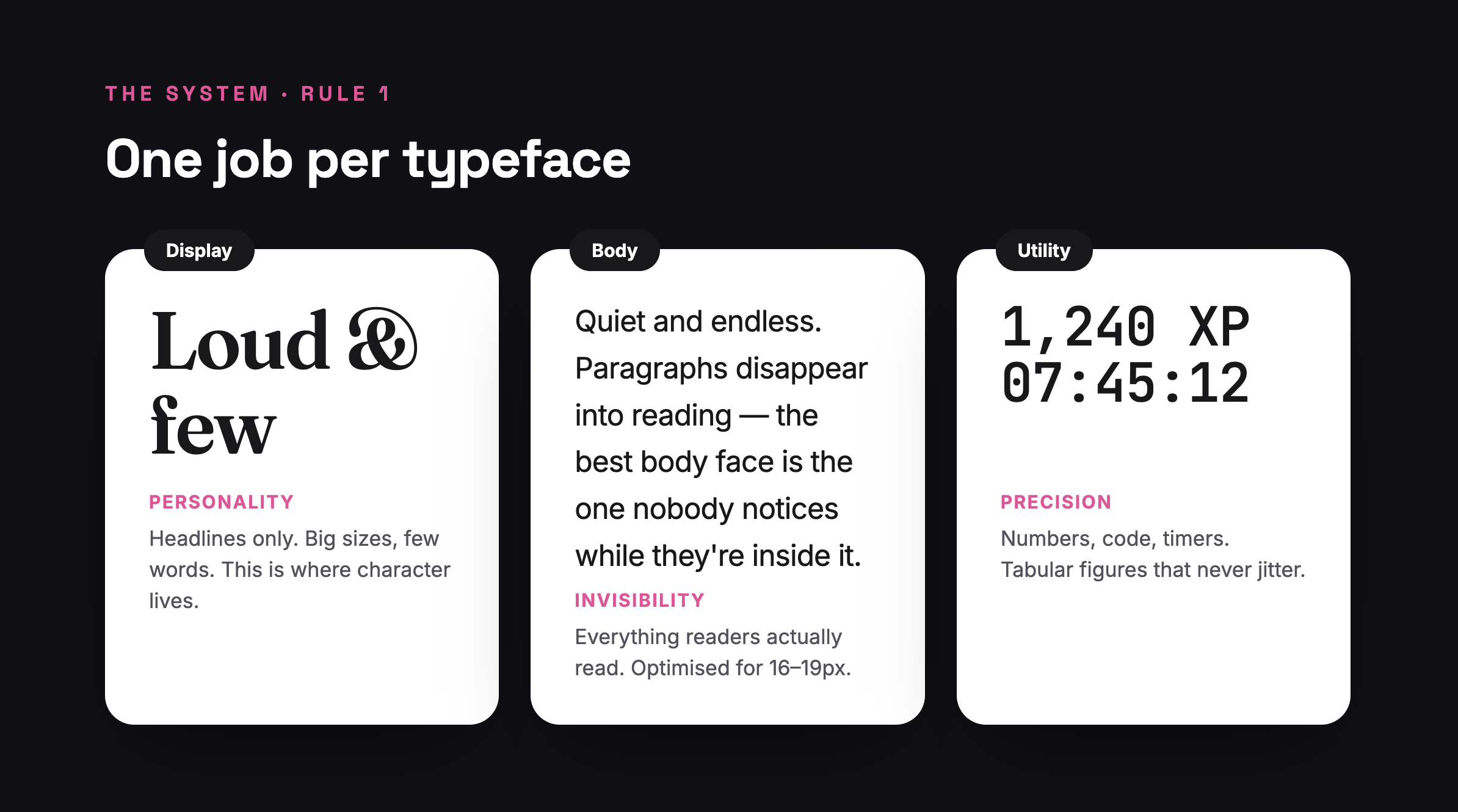
Display — headlines only. Big sizes, few words. This is the only place personality belongs.
Body — everything people actually read. Its job is to disappear. If a reader notices your body font, it's failing.
Utility — numbers, code, data, timers. Usually a mono with tabular figures, so digits can change without the layout shifting.
The moment fonts have jobs, "do these pair?" becomes a much easier question: do they stay out of each other's lane?
Rule 2 — Pair by contrast, not similarity
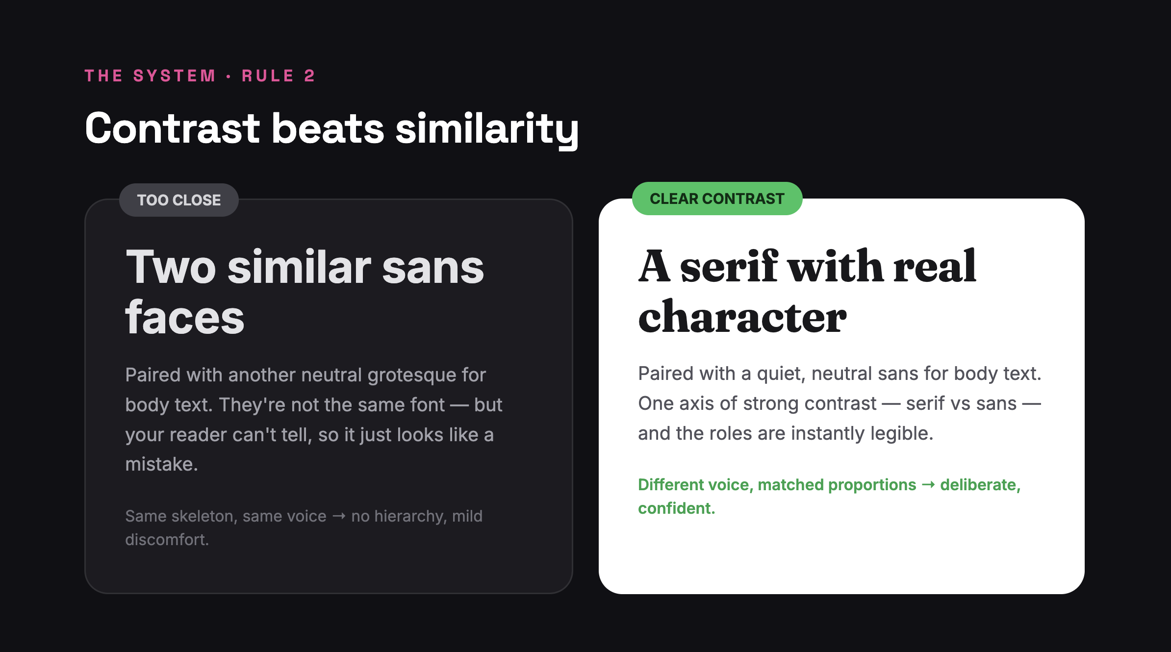
The most common beginner mistake is pairing two fonts that are almost the same — two neutral grotesques, two geometric sans faces. The result doesn't read as a pairing at all. It reads as an inconsistency.
Deliberate pairings have one axis of strong, obvious contrast:
Serif display + sans body (the classic)
Heavy display weight + regular body weight
Wide, characterful display + narrow, quiet body
Pick one axis and push it hard. If someone can't tell your two fonts apart at a glance, they're too close. If everything contrasts at once — serif vs sans and wide vs narrow and heavy vs light — it's a food fight.
Rule 3 — Match the skeletons
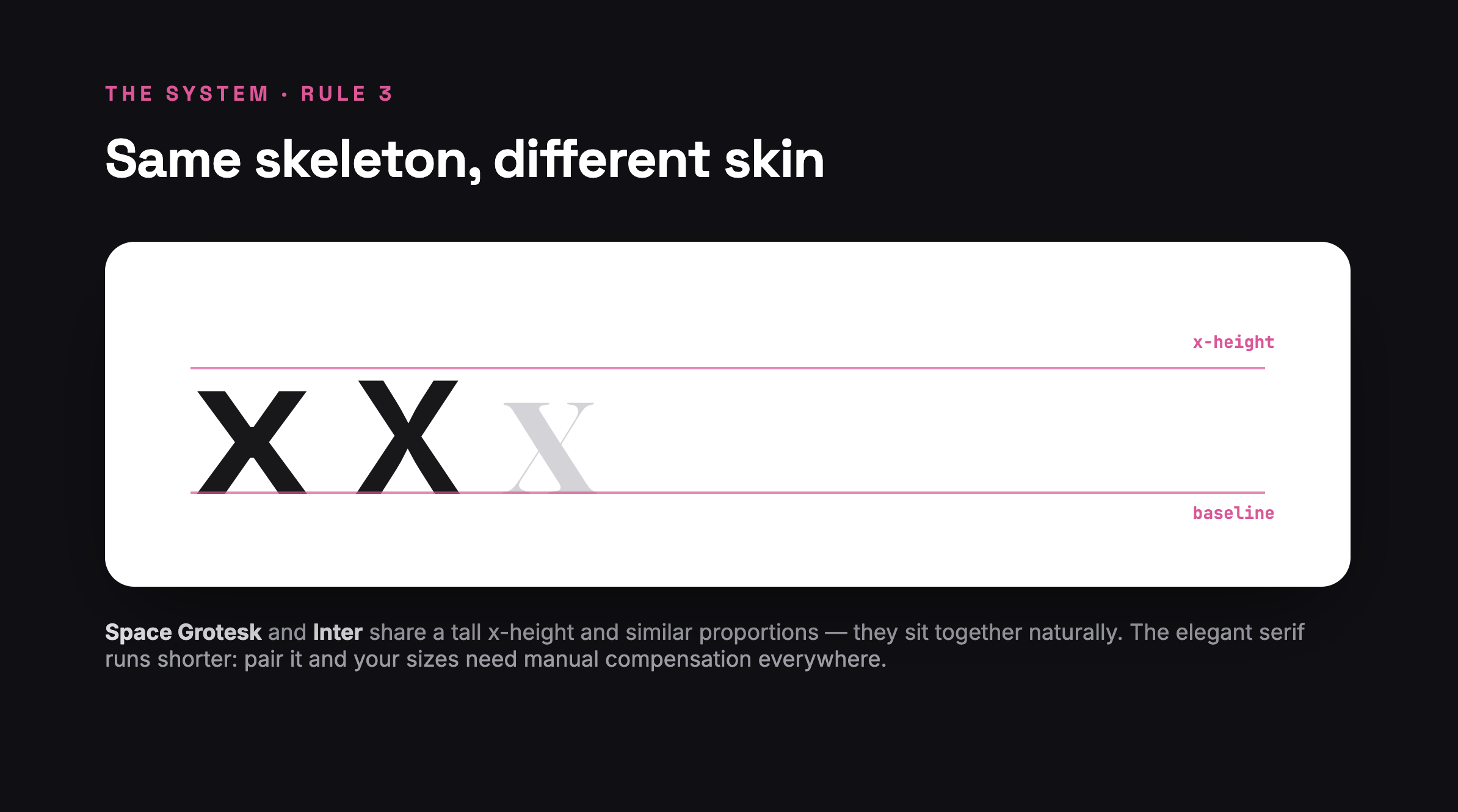
Here's the part vibes can never catch: while the voices should contrast, the bones should match. Compare candidates on three measurements:
x-height — lowercase letters should feel the same size at the same point size. A tall-x sans next to a short-x serif forces you to hand-compensate sizes forever.
Proportions — similar width and roundness of letterforms keeps rhythm consistent across a page.
Apertures — how open letters like a, e, c are. Open pairs with open; closed with closed.
The fastest test: type the same sentence in both fonts at the same size and put the lines right next to each other. If one line looks noticeably bigger, denser, or darker, keep looking.
Rule 4 — Two families, plus one utility. That's it.
Every additional family multiplies your decisions: weights, sizes, line-heights, letter-spacing — per font, per breakpoint. Two families cover 95% of products. The third slot is reserved for a working font — a mono for numbers and code — not a third voice.
If you feel the urge for a third voice, what you usually need is a new weight or size of a font you already have.
Rule 5 — Test at real sizes, with real words
Type specimens lie. "Handgloves" at 96px tells you nothing about a checkout form at 15px. Before committing:
Set your body candidate at your actual body size (16–18px) in a full paragraph of real content.
Set your display candidate in your longest real headline — not your shortest.
Check both on a phone, in both light and dark themes.
How we did it at Meelro
We ran exactly this system when building Meelro, and you're looking at the result every day you practice:
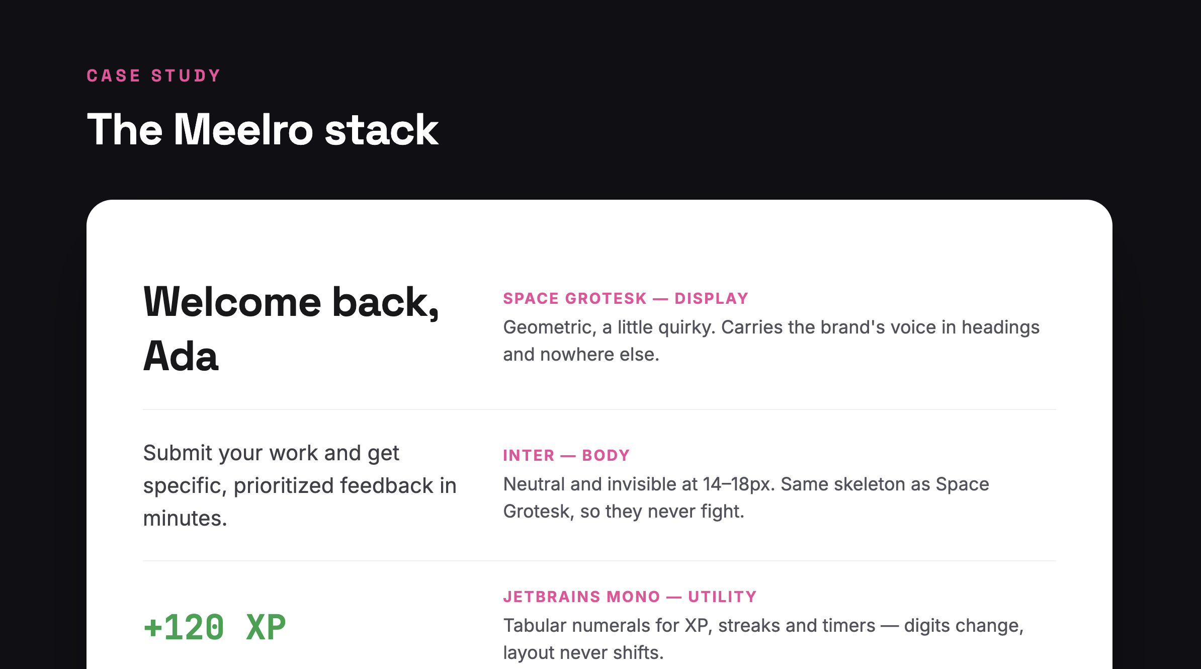
Space Grotesk for display. Geometric with just enough quirk to carry a personality — but only in headings, where its character earns its keep. One axis of contrast against the body: weight and width, not serif vs sans.
Inter for body. As close to invisible as a screen font gets. Crucially, its skeleton — tall x-height, open apertures — matches Space Grotesk almost perfectly, so the two sit on the same line without size compensation.
JetBrains Mono for utility. Every XP number, streak counter, and timer uses tabular figures — when your XP ticks from 999 to 1,000, nothing in the layout shifts by a pixel.
Notice what we didn't do: no third voice, no decorative script, no serif "for warmth." Three fonts, three jobs, one contrast axis, matched skeletons.
The checklist
Next time you're pairing, skip the vibes and run the list:
Did I define the three roles before opening a font menu?
Does my pairing have exactly one strong contrast axis?
Do the x-heights and proportions match?
Am I at two families + one utility, or fewer?
Did I test at real sizes with real content, on a phone, in both themes?
Five yeses and you've stopped pairing by vibes — you have a system.
Want the reps? Typography is one of Meelro's 16 practice tracks — a real brief every day, honest critique on what you make. The fastest way to internalize this system is to use it tomorrow morning.