Stop Choosing Colors, Start Assigning Jobs
By Meelro· July 5, 2026 ·5 min read
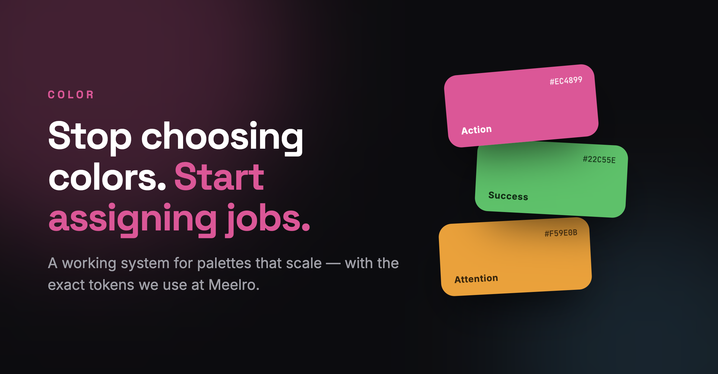
Open any color picker and you're staring at infinity. That's the trap: picking colors you like instead of colors that do something. A good palette isn't a set of pretty swatches — it's a set of jobs, each with exactly one color assigned to it. Here's the system, and the exact one we use to build Meelro.
Why "pretty" palettes fall apart
Choosing colors by taste feels productive — you generate five swatches that look nice together and move on. Then reality hits: you need a success state, an error, a disabled button, a hover, a dark mode. Suddenly your five pretty colors can't answer basic questions, so you improvise, and the interface slowly turns into a bag of skittles. The problem was never the colors. It was that none of them had a job.
A palette isn't what looks good together. It's a list of jobs, each with one color that owns it.
Rule 1 — Give every color a job
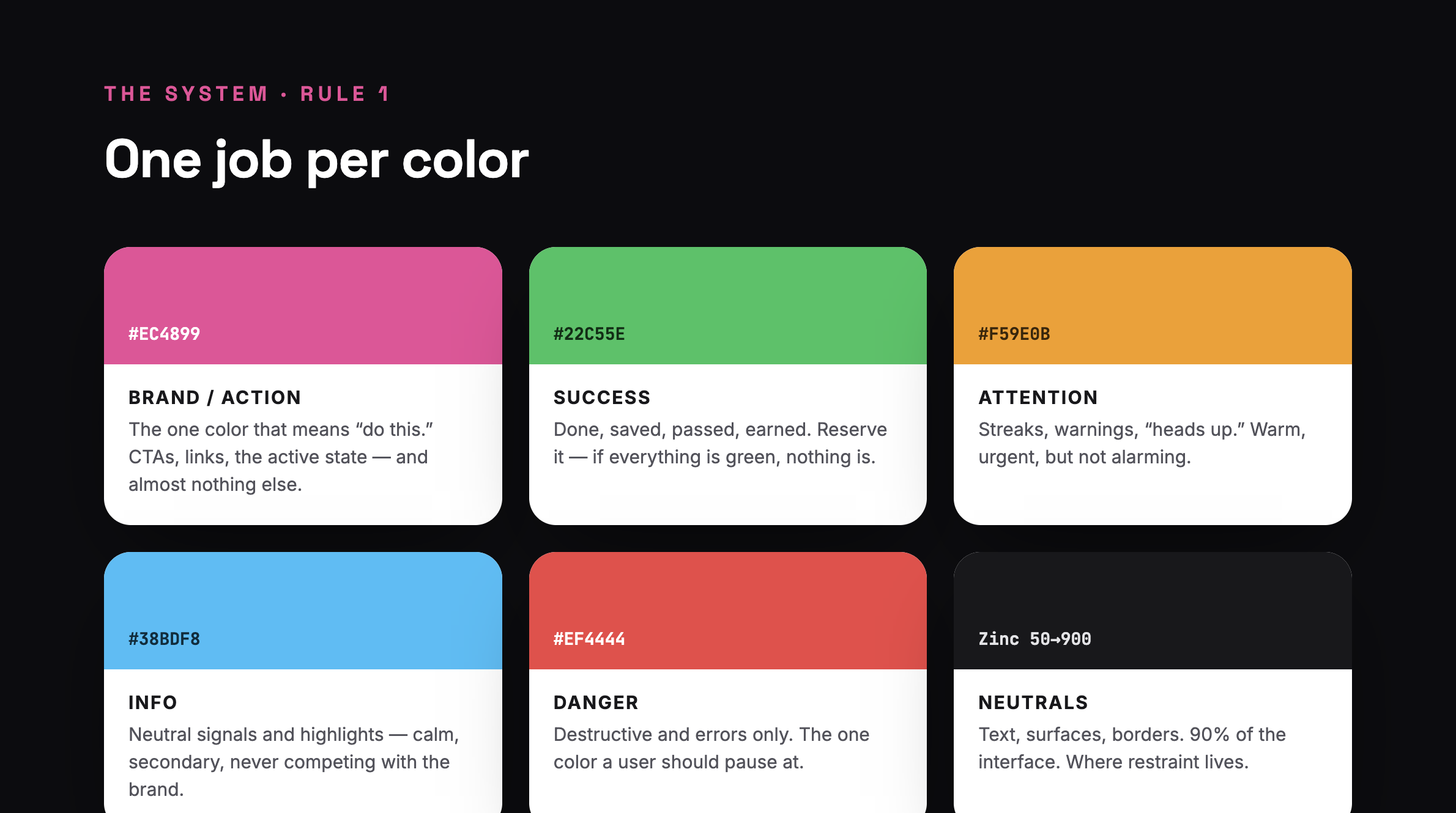
Before you pick a single hue, list the jobs your interface actually has. Almost every product needs the same short set:
Brand / Action — the "do this" color. CTAs, links, active states. One color, used sparingly.
Success — done, saved, earned, passed.
Attention / Warning — heads-up states that aren't errors.
Danger — destructive actions and errors, and nothing else.
Info — neutral highlights and secondary signals.
Neutrals — text, surfaces, borders. This is 90% of your screen.
Once colors have jobs, "which blue?" stops being a taste question and becomes a functional one: does this color do its job clearly, and stay out of the others' way?
Rule 2 — Spend color like money (60-30-10)
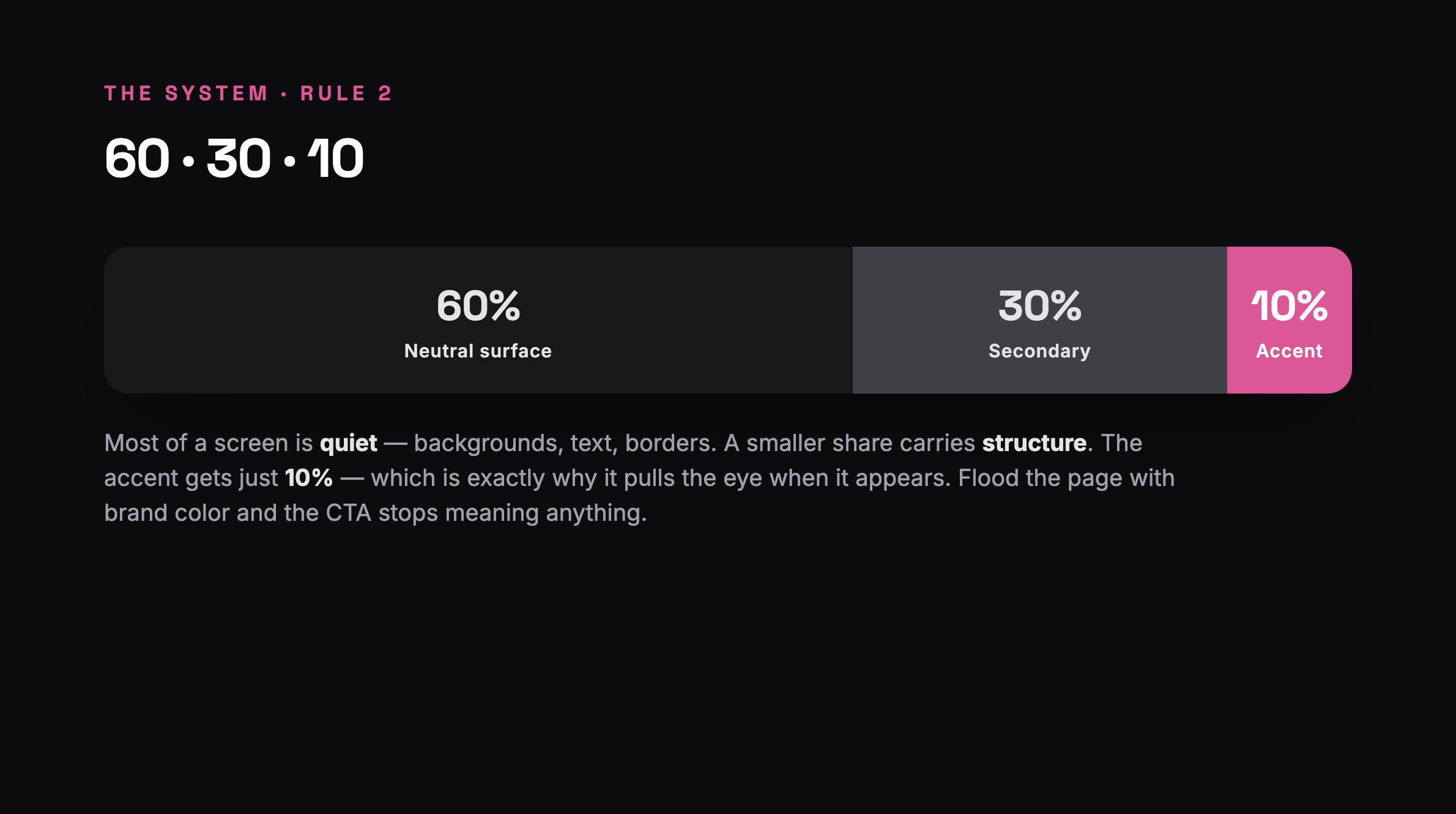
Color is a budget, and your accent is the expensive part. The classic split:
60% — a dominant neutral (your backgrounds and surfaces).
30% — a secondary tone that gives structure.
10% — your accent, the brand color.
That 10% is the whole trick. The accent works because it's rare — the eye jumps to the one pink button on a calm grey screen. Paint the whole page brand-color and you've spent your entire budget on noise; now nothing stands out, least of all the thing you wanted clicked.
Rule 3 — Name colors by job, not by hue
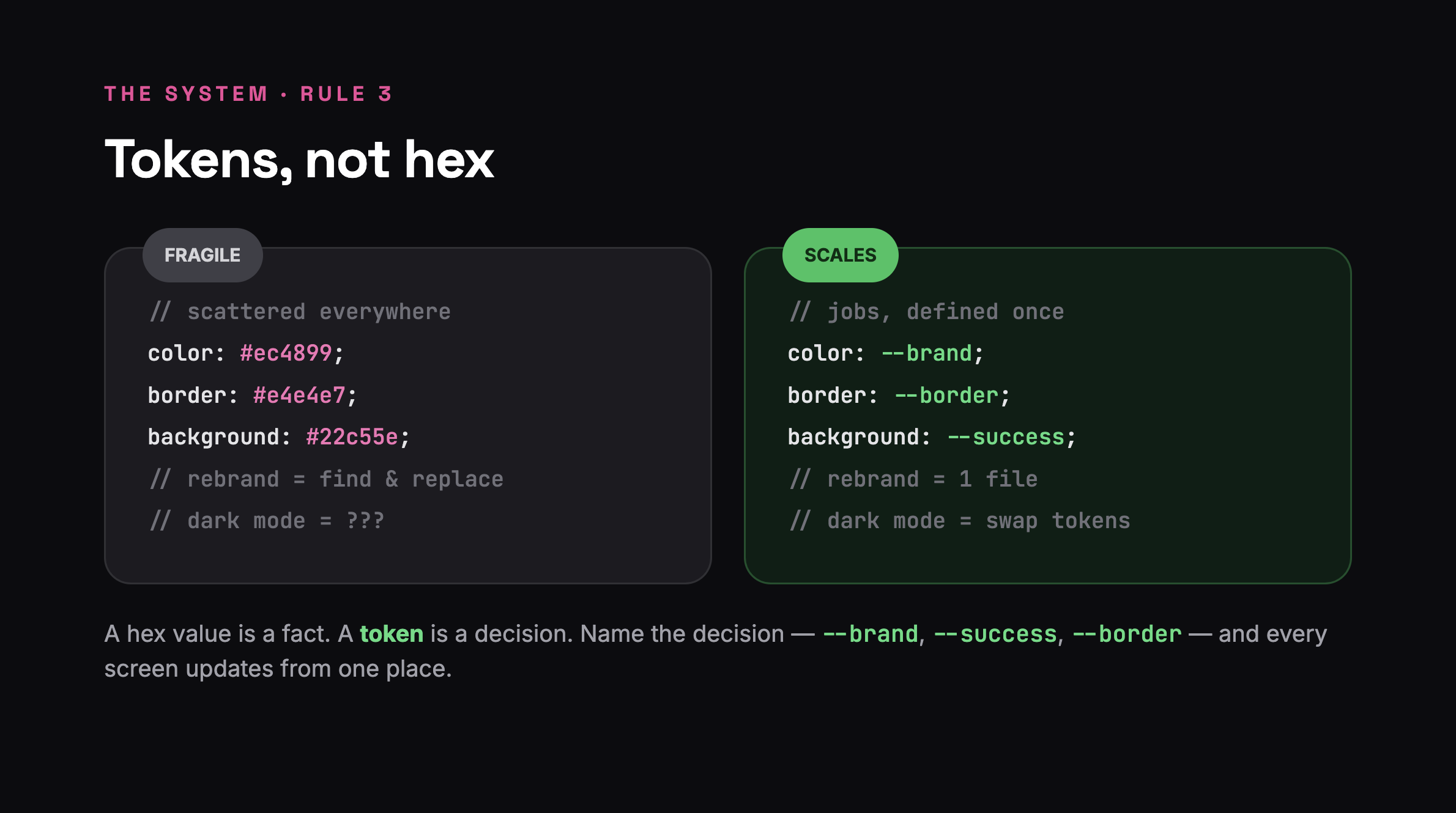
Here's where systems beat vibes permanently. In your code and design file, never reference a color by what it is (#ec4899, "pink-500"). Reference it by what it does (--brand, --success, --border). These are semantic tokens, and they buy you three things:
One source of truth. Rebrand from pink to blue? Change one value, every screen follows.
Dark mode for free.
--surfaceand--textjust resolve to different values in dark — you never touch a component.Meaning survives.
--dangertells the next developer what it's for;#ef4444tells them nothing.
If you find yourself typing a raw hex value inside a component, treat it as a smell. It means a decision escaped your system.
Rule 4 — Contrast is a rule, not a preference
A color can have the right job and still fail if nobody can read it. Every text-on-background pair needs to clear WCAG AA — 4.5:1 for body text, 3:1 for large text. This isn't an accessibility tax; it's what makes your interface legible in sunlight, on cheap screens, for tired eyes. Check your accent-on-white and text-on-surface pairs with a contrast tool before you fall in love with them, not after.
Rule 5 — Build tints from your jobs, not new colors
You'll need lighter and darker versions — a hover, a subtle background, a border. Don't reach for a new color; derive them from the job color you already have (a 10–15% tint for backgrounds, a step darker for hover). This keeps the family coherent. The urge to add a sixth or seventh base color is almost always the urge for a tint of one you already own.
How we do it at Meelro
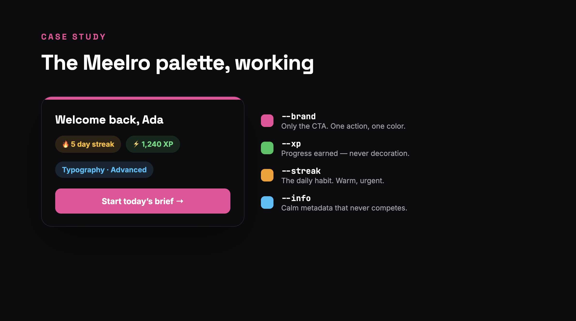
Meelro runs on exactly this system — a semantic token set we call "Studio." You're using it on every screen:
--brand(pink) is reserved for one thing: the action you should take next. The "Start brief" button, the primary CTA. It's the only pink on most screens, which is precisely why your eye goes to it.--xp(green) means progress you earned — XP totals, completed states. Never decorative, so when you see it, it means something.--streak(amber) owns the daily habit — the flame, the streak count. Warm and urgent without being alarming.--info(blue) carries calm metadata — track labels, secondary highlights — and is tuned to never fight the brand color for attention.
Everything else is neutral. No component in the codebase hard-codes a hex value; they all reference tokens, which is how the entire app flips to dark mode without a single component change — and how, if we ever rebrand, the whole product turns on one file.
The checklist
Next time you build a palette, skip the swatches and run the list:
Did I list the jobs before picking any color?
Does exactly one color own each job?
Is my accent about 10% of the screen, not 50%?
Is every color named by its job, not its hue?
Does every text pair clear 4.5:1 contrast?
Are my tints derived from job colors, not new ones?
Six yeses and you've stopped choosing colors. You've built a system that assigns them.
Want the reps? Color Theory is one of Meelro's 16 practice tracks — a real brief every day, honest critique on what you make. The fastest way to internalize a system is to ship with it tomorrow morning.